
KerfCase

I’ve been an employee of KerfCase LLC since October of 2016. Working at a combination specialty wood shop and ecommerce company is a great way to pick up a lot of different skills, and during my time there I have learned a lot about small-batch production, online marketing, and how a small business functions.
KerfCase’s website is built on the Shopify platform, which is a robust template-based ecommerce platform that allows for both WYSIWYG editing and direct code manipulation. Over the years, many developers and contractors have built on our theme, adding features and tweaking performance. Without having a developer on staff, we were locked into the basic look and functionality of the site, since a fundamental overhaul would be prohibitively expensive and labor intensive.
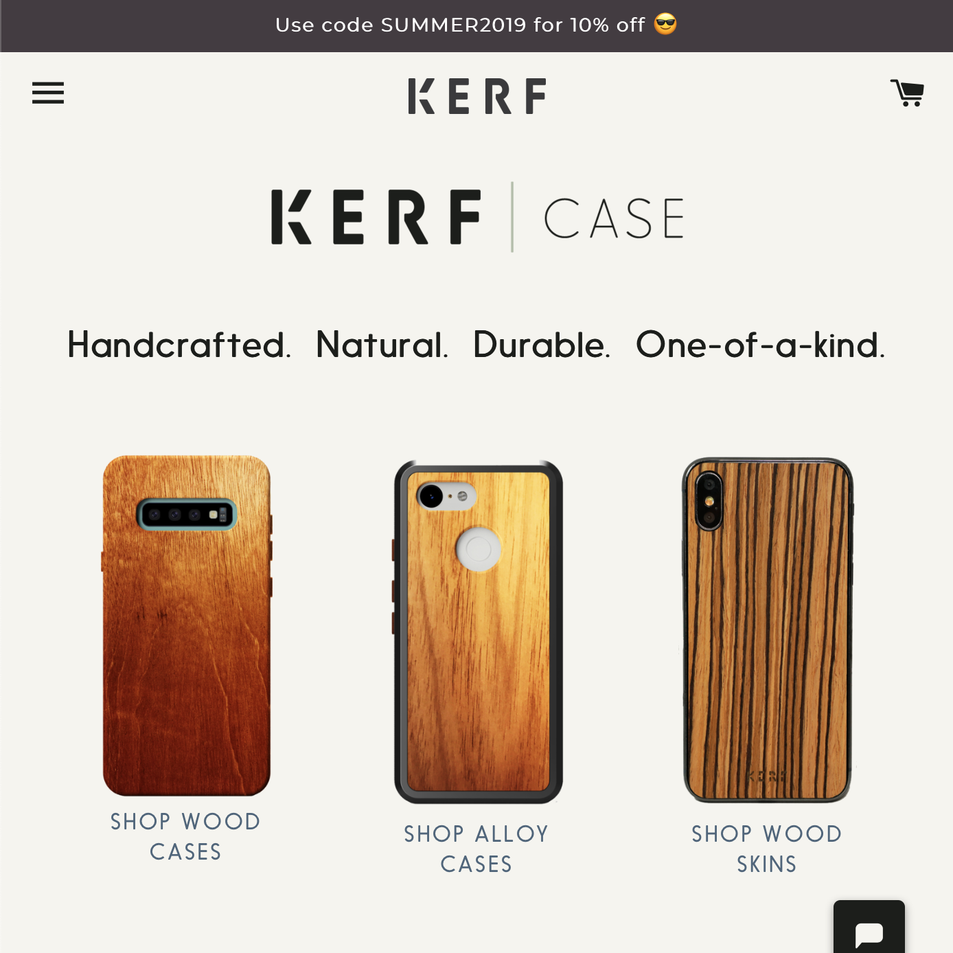
As Kerf grew and began to diversify its product line, we reached a point where we wanted to change our branding to reflect our new identity. We hired a graphic designer to revise our logo and come up with a consistent visual and design language for our brand, including colors, typefaces, and layouts. The hope was that we would then hire a web developer on contract to apply these changes to our site.
As luck would have it, I had begun studying programming, and felt confident that it would be great for my professional development, and much less expensive for the company, for me to take on the task of totally visually overhauling our site. Work began in May 2019 and the revamped design went live in July of 2019. Along the way I learned a lot about project planning, the software deployment process, and the quirks and tricks of managing a large production site.
Key features:
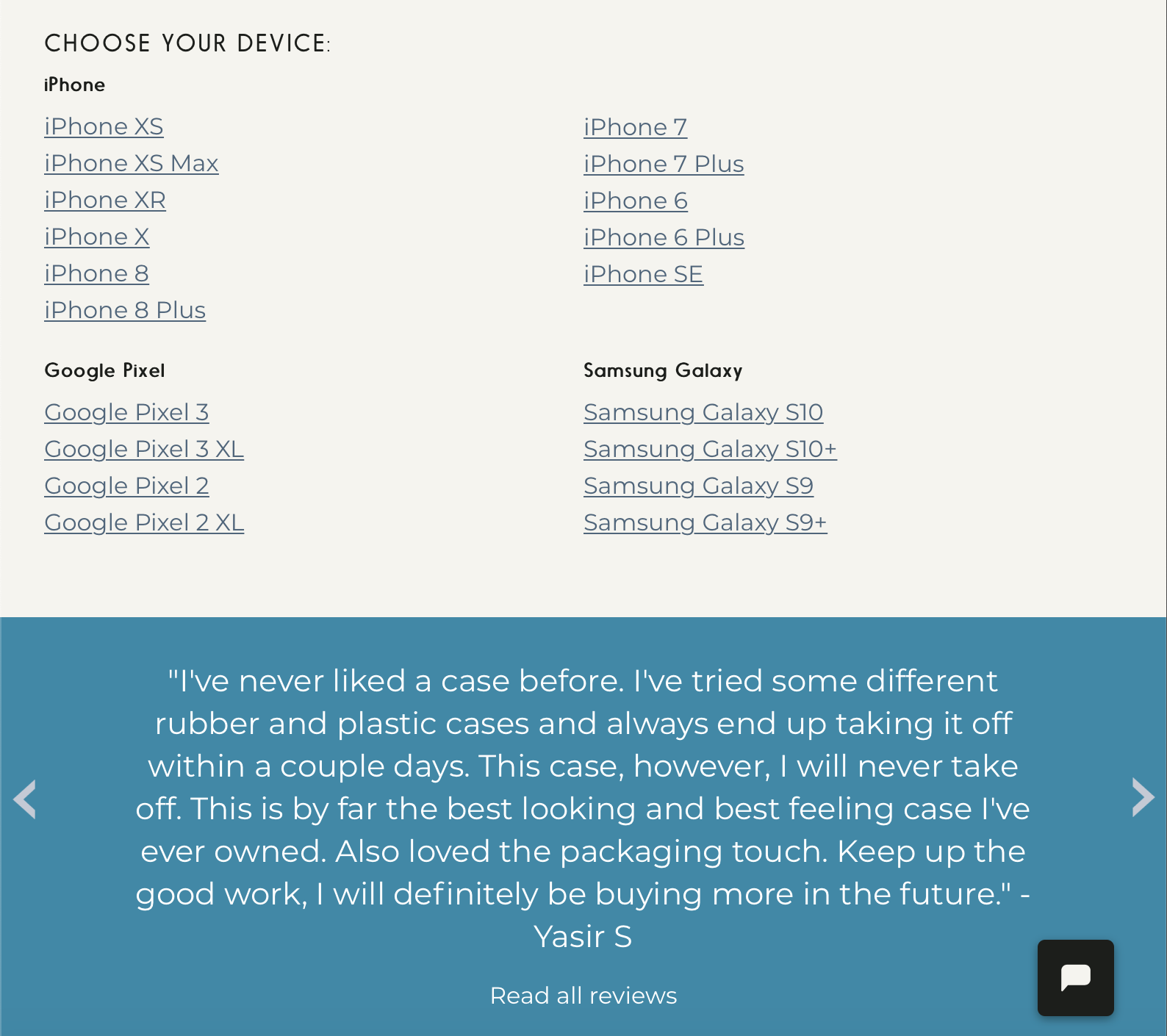
Mobile first
Mobile traffic forms the majority of our page views, so I began my design and style work focusing exclusively on mobile, coming around to desktop layouts late in the process. This helped me create consistent visuals and utility across the site, and made responsive design simple to implement.
Grids
Our graphic and user interface designers came up with a variety of grids and grid-based layouts to create a consistent and aesthetically pleasing interface. I had a lot of fun using photoshop and CSS to reproduce their mockups down to the pixel.
Menus and overlays
Creating dynamic menus and information-rich hover overlays gave our site a new dimension, and our users a quick way to get their bearings. I learned a lot about JavaScript and the DOM when implementing these features, but used pure CSS when possible.